Video Length: 3:01
Blog Module with Grid Layout
The Elegant Themes blog post of April 2017, The Ultimate Guide to Using Images Within Divi, notes that the default width for Divi blog images is 795 pixels. They recommend using the 16:9 ratio, so a blog module featured image should be 795 x 447px.
However, I find the edges of the image are trimmed if I use this size when using the blog module set to grid layout. One wouldn’t normally notice a slight cropping, but I used an image with a thin yellow border and it was very obvious when the border was missing from the left and right sides.
I played around with sizes and discovered that the size that worked perfectly was 795 x 500 pixels.
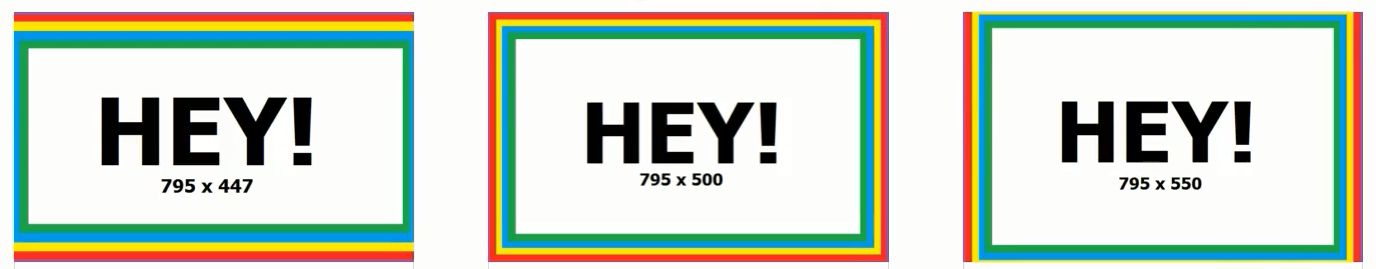
I prepared an image with a multi coloured border so I could see exactly where it was being cut off. Please feel free to download and try for yourself. Here are the 3 different sizes:


When I used these 3 images on 3 different blog posts, this is what I saw. The recommended size is cropped left and right. The bigger size is cropped top and bottom. The middle size (795 x 500) is just right.
Am I overlooking something fundamental? As far as I can see, the perfect size for a featured image on the Divi blog module using the grid layout is 795 x 500 pixels.
Hi
Thanks for your post … I had situation 1 always. Resizing the images to 795×500 helpes to solve the problem.
Nevertheless it feels wrong from a web design perspective. As a web developer I would leave the image as is, scale the image to the max possible width and do not crop in any direction.
Thanks again for your insights
Glad I could help Marcus.
I have been struggling to adjust the size of featured on my website. You helped me a lot. Thanks so much!
Thanks for this post. I saw your 795×447 first, and without reading the rest, created the featured image at that size. It’s just fine. If I decide to use it in a modular way such as you do, I may have to go the 550.
I admire the way you figure things out, and you create these trial-and-error images to look professional as well. As a visual designer, I have created hundreds of tools such as yours, to see where the crop should be. (I’ve even done that to figure out how many racks of ribs would fit on my barbeque!)
Someday I’m going to create a poster called Trial & Error, but until then, if you like the “fun & fabulous ampersand” enjoy the rest of my AmperArt series at amperart.com
Thanks again for the post.
Hey Chaz,
Thank you for your comment. I’d love to hear more about the racks of ribs on the BBQ – you’ve got me curious!
I’ve been trying to work this out AAAAALLLLLLLLLLLL Day… You’re a Genius! 🙂
Ha ha, thanks Tony! Glad I could help 🙂
This saved me SO MUCH TIME. i was pulling my hair out trying to figure out the right size. It was weird. When you open the article page, the graphic is fine. But on the home page it was getting cut off. THANK YOU!!
Ha ha, glad I was able to help before you did any serious damage to your hair!
Thank you for this! So many size recs, it’s great to have someone test out the best.
Do you know of any way to use portrait size photos in blog posts with the grid layout? I have a client who has an obituary section and all of those photos come in portrait size. Any thoughts? Thanks!
Yeah, that’s a challenge. I’ve lost count of the number of times I’ve cropped the portrait image supplied by the client into a landscape shape I can use as a featured image on a blog post.
No doubt there’s a tricky css solution but I’d be more inclined to make it work for you. Using Canva or Photoshop, could you make a correctly sized (795 x 500) box and add the portrait image to one side, with the name and birth/death dates to the other side?
2019 and this post keeps on giving! thanks for working this out and passing along the info in such a thoughtful way!
Thanks Ignacio!